


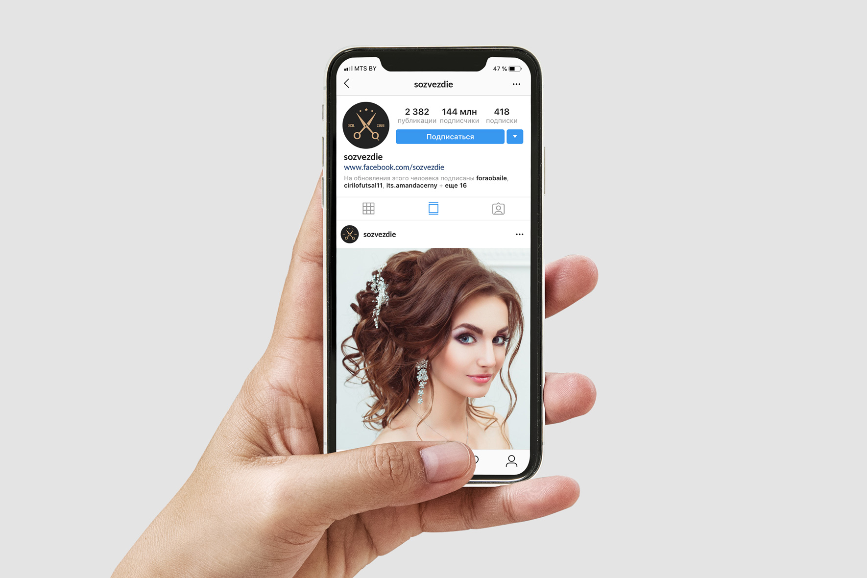
Identity of Sozvezdie hair studio
Over the long period of its existence, the studio has formed a loyal customer base and decided to update the corporate identity.
Make it relevant and stylish
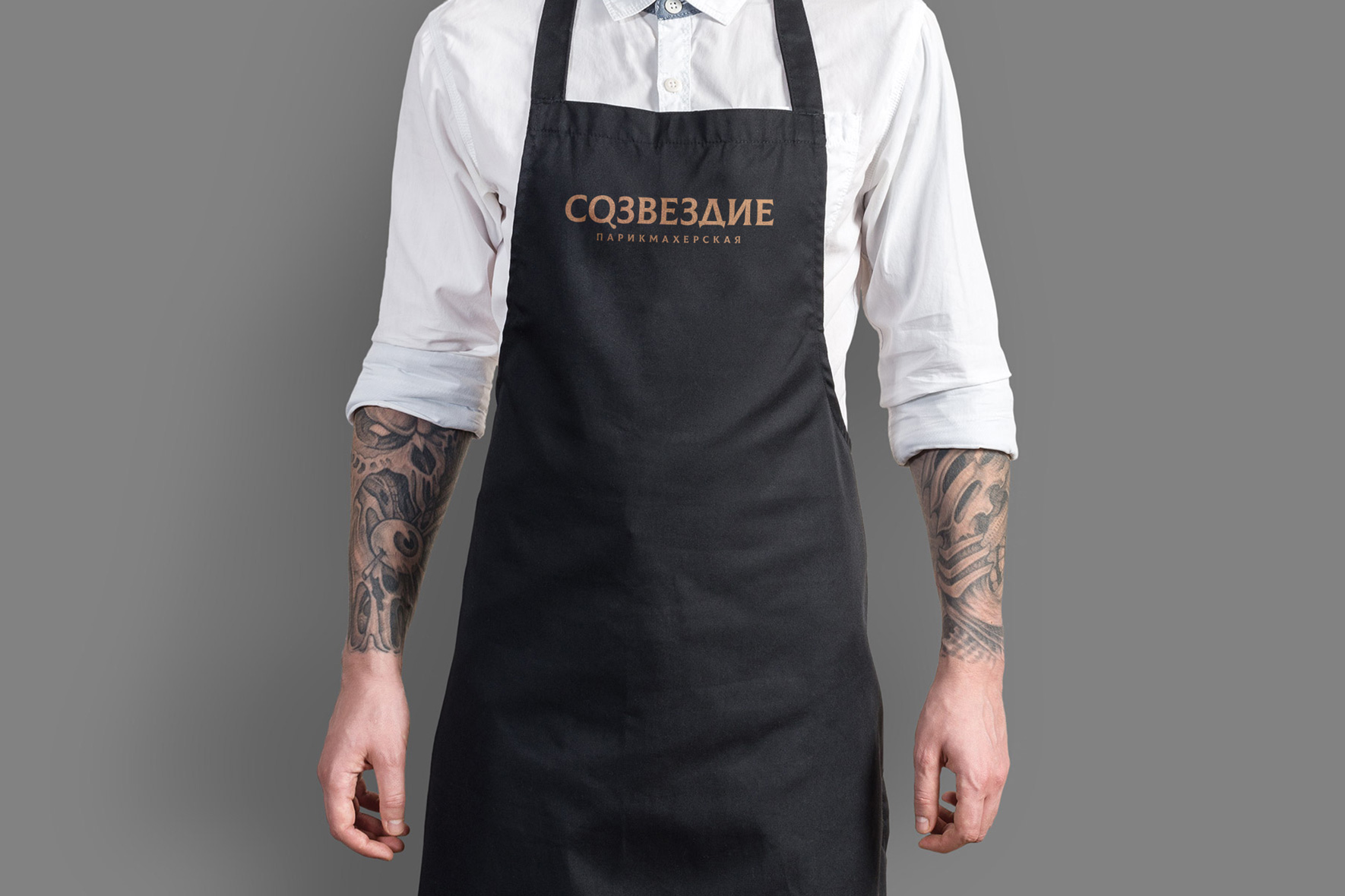
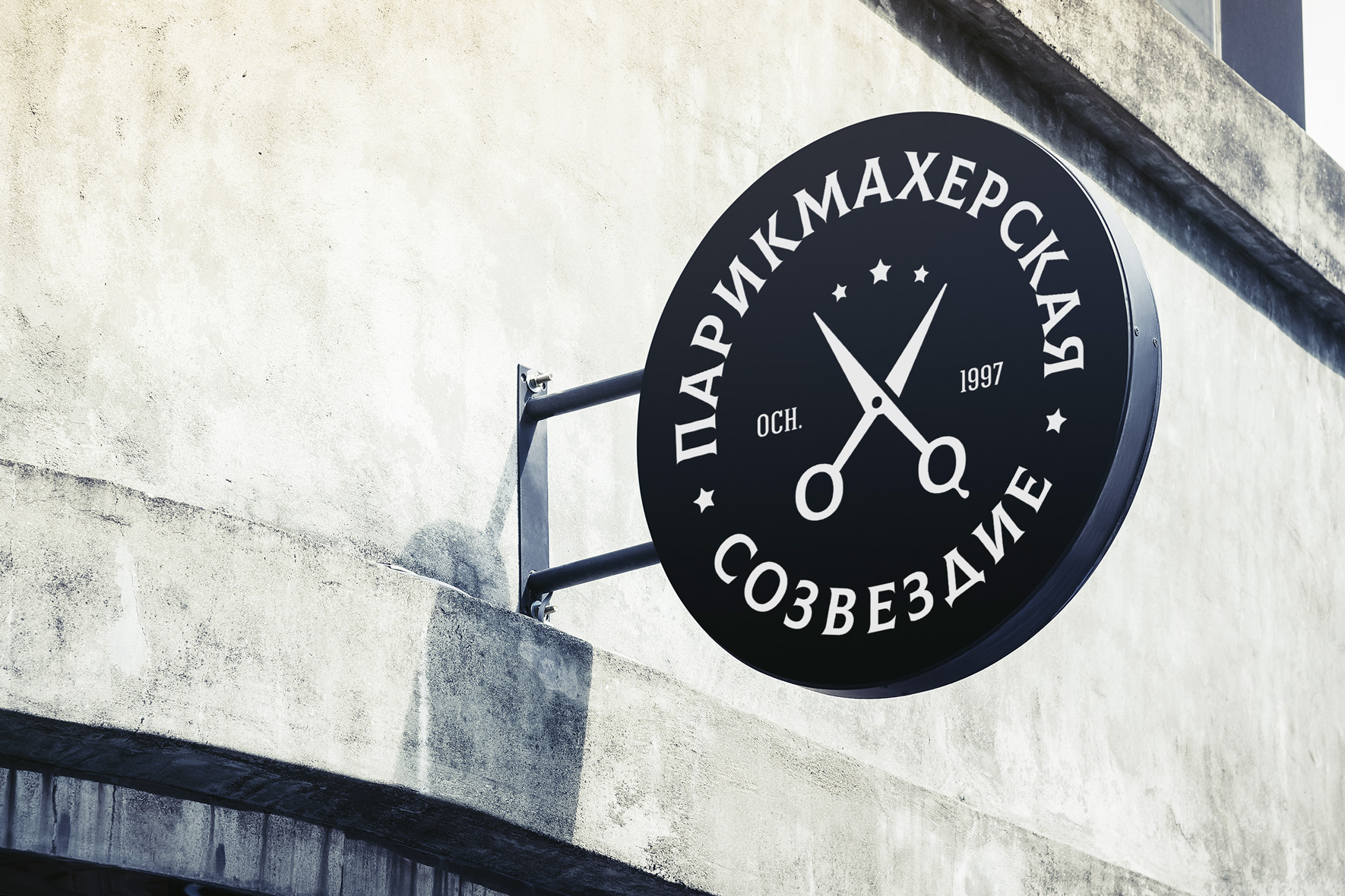
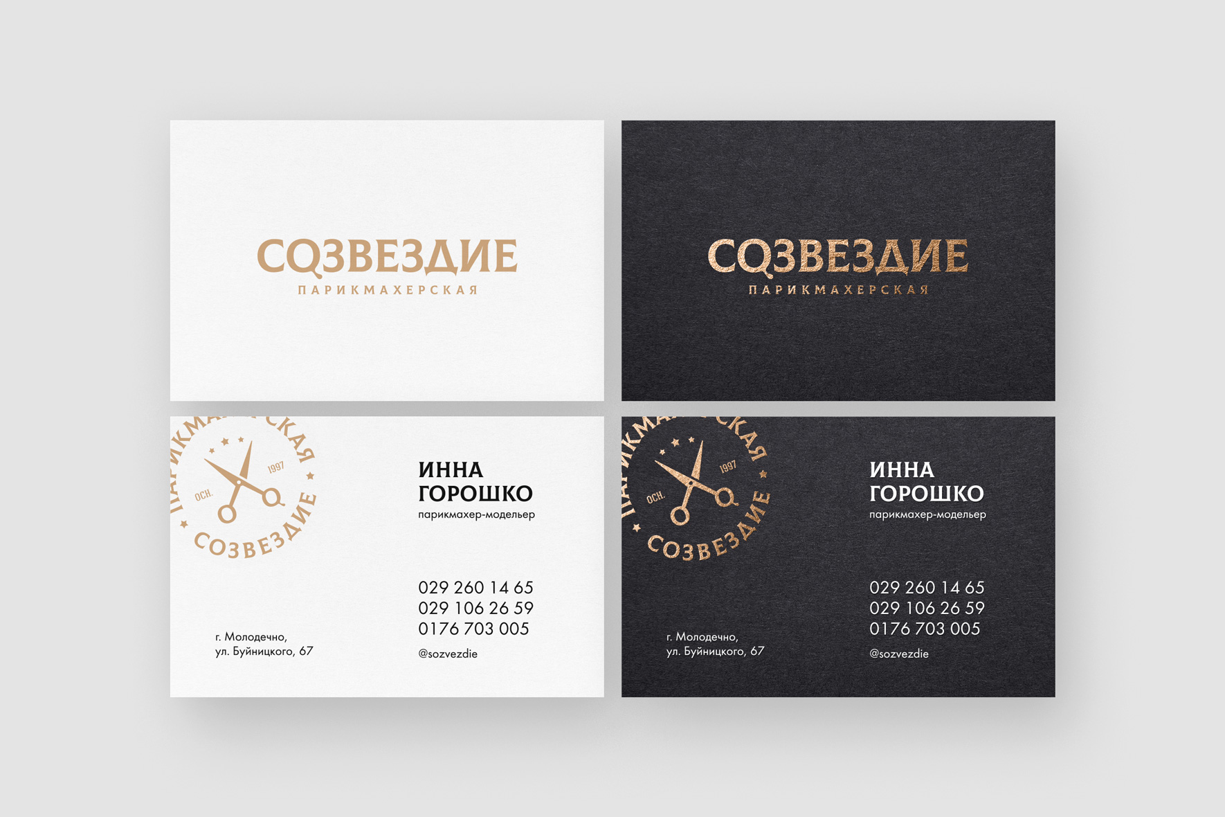
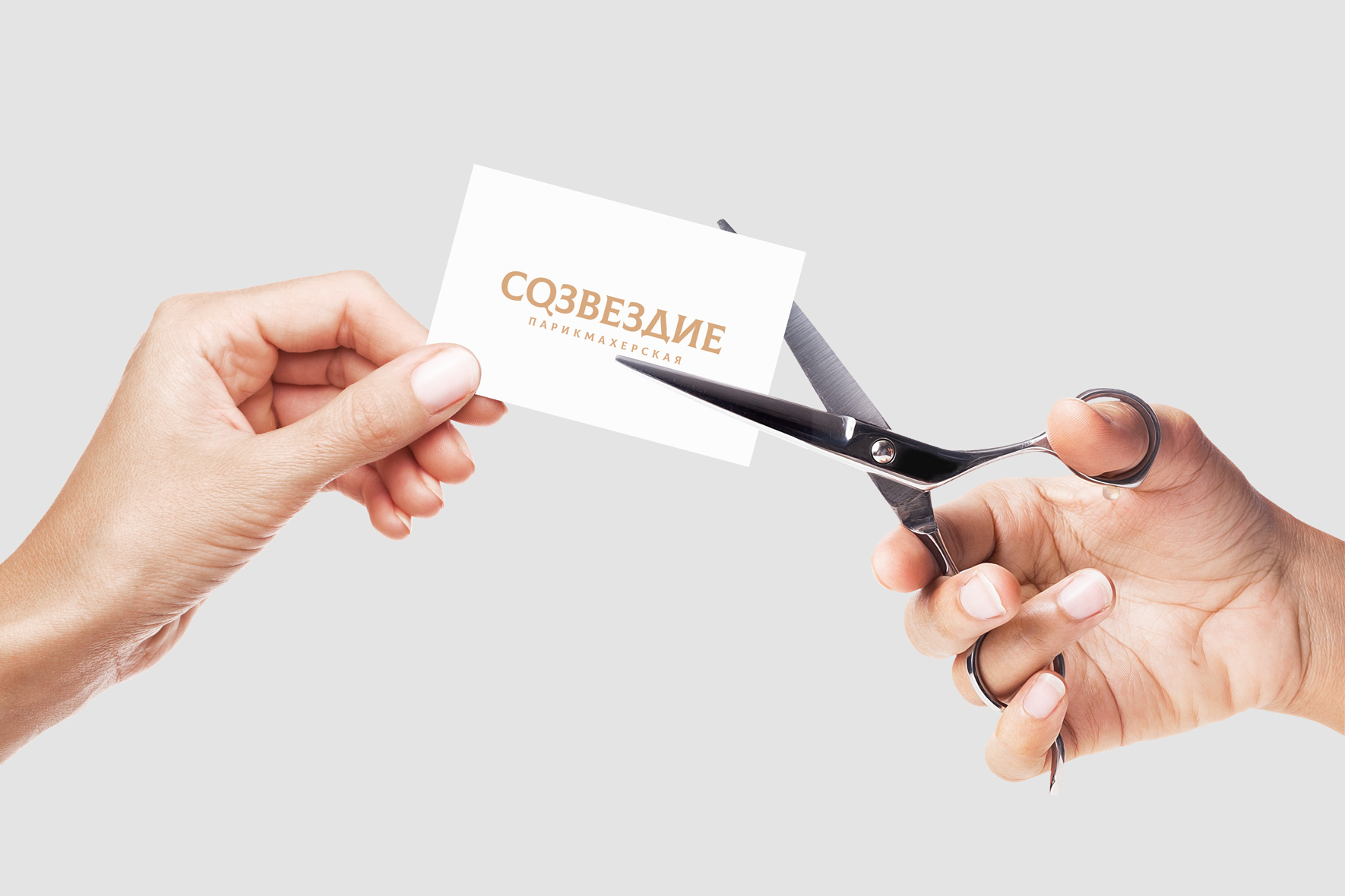
The logo turned out to be strict and neat. The font emphasizes the tradition, and the combination of gold and black colors emphasize the premium quality of the services provided.
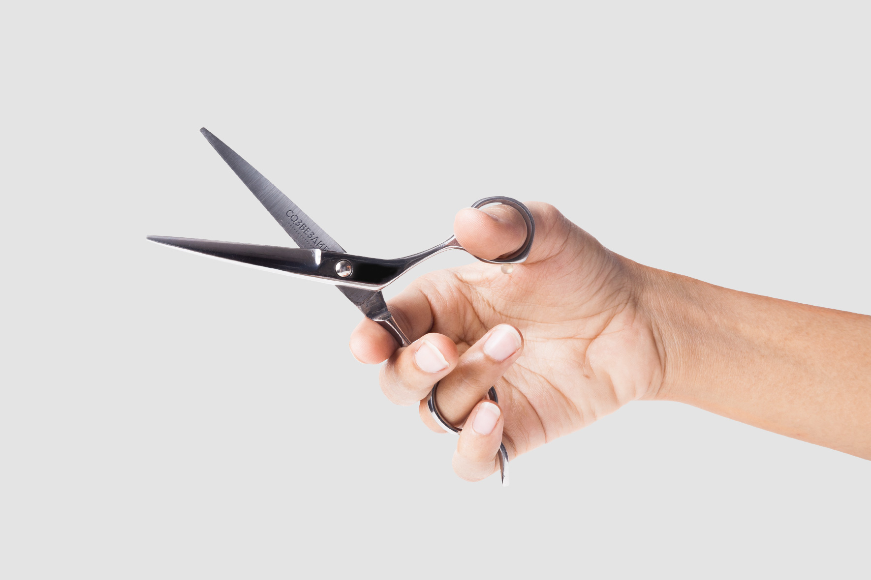
The letter «O» in the logo has a small branching element that symbolizes the finger rest of the ring in the structure of hairdressing scissors.

Client
Constellation
Services
Corporate branding
Logo
Identity
Date
September, 2021

Let's talk business
Fill out the form and we will contact you. As a rule, this happens during the working day.