Family Nest cafe logo
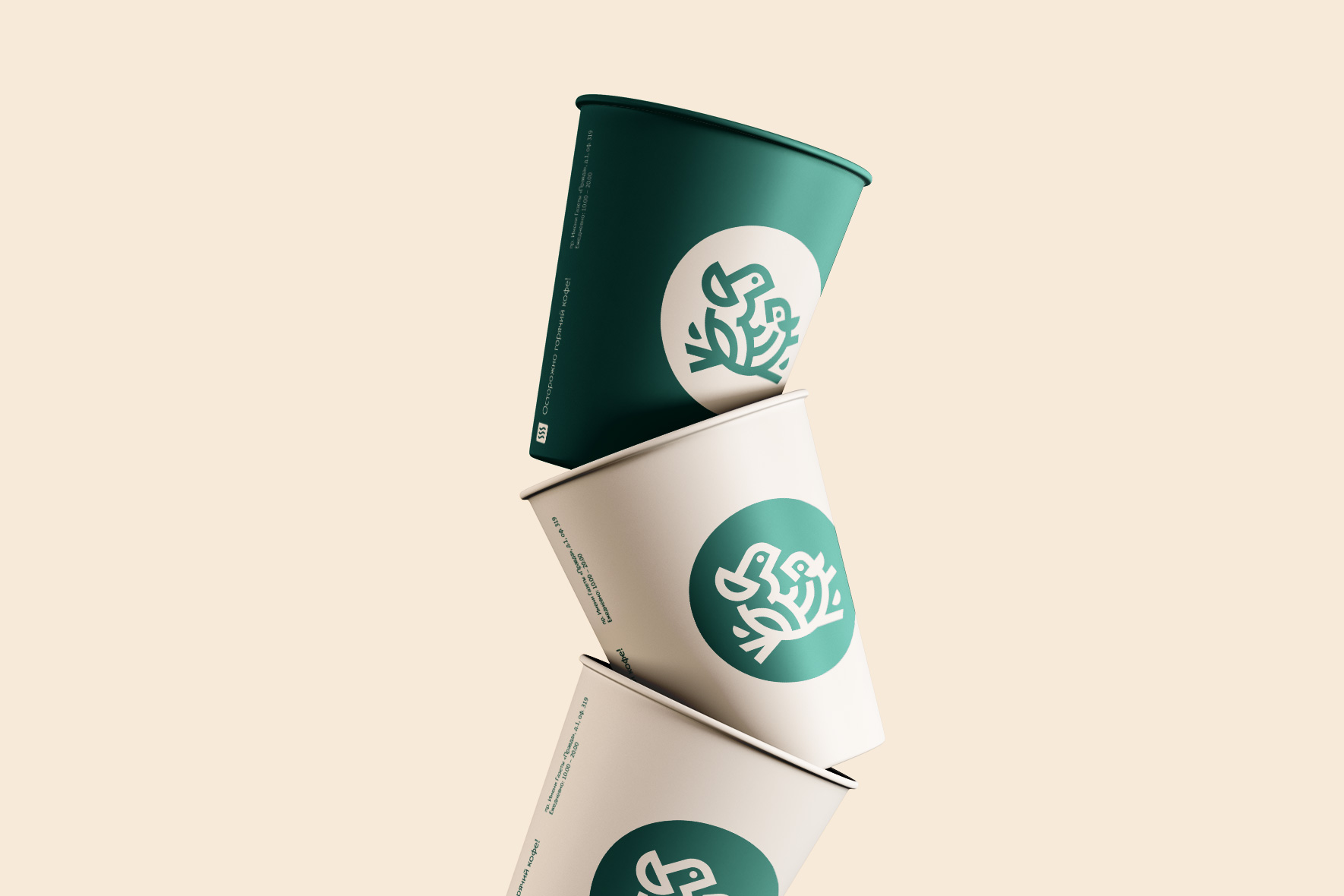
My sun-shine. Mother’s joy, father’s pride. And who is so sweet with us?
Never mind. When we did this case, the level of oxytocin, a hormone responsible for love for children, rose sharply in our office.
And why is it so? Because Family Nest is a super kind, cozy and developing place for children and their parents. Like home, sweet home, only outsourced. While the kids play in a safe, creative space, moms and dads can sip coffee and relax.
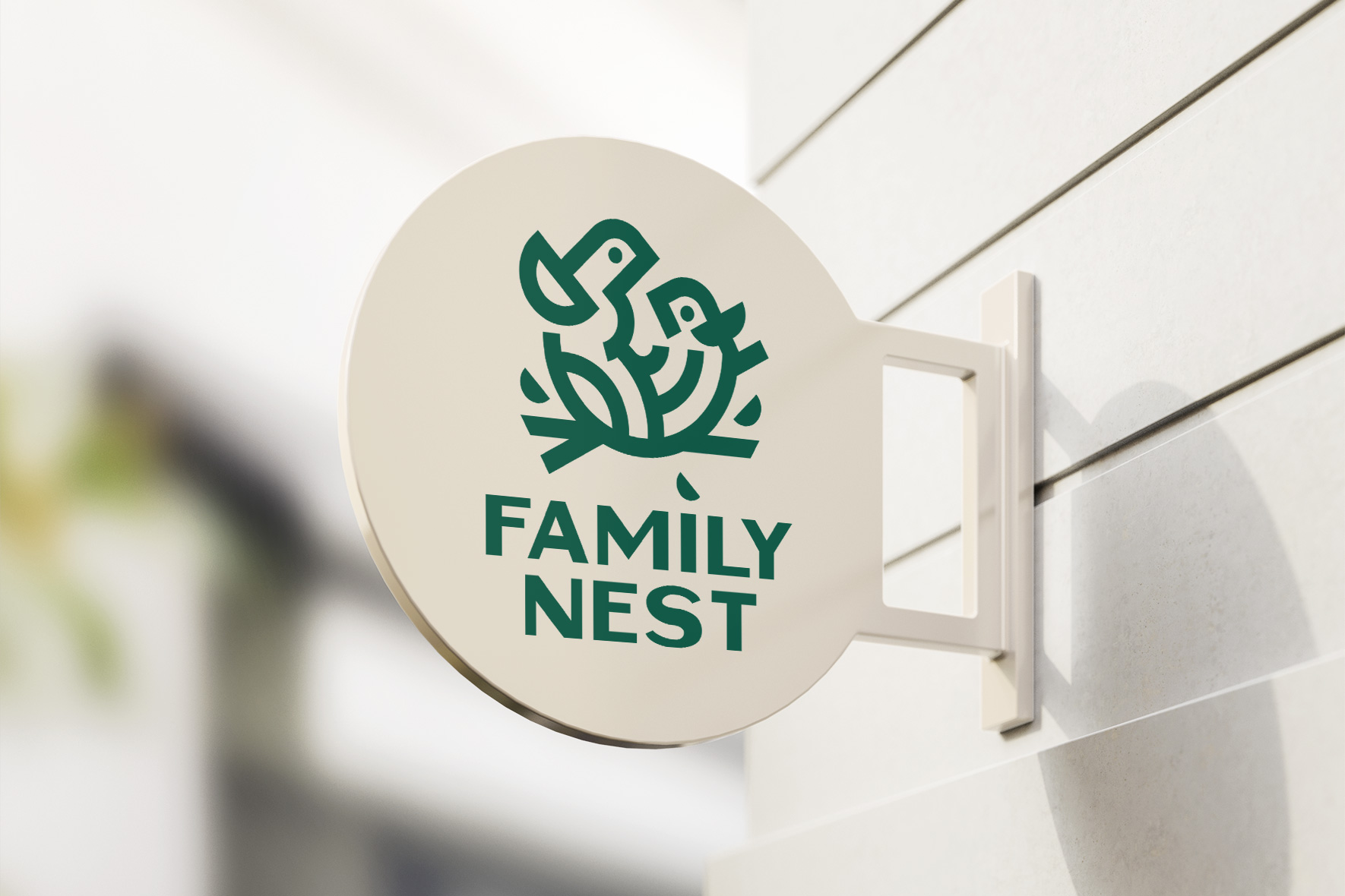
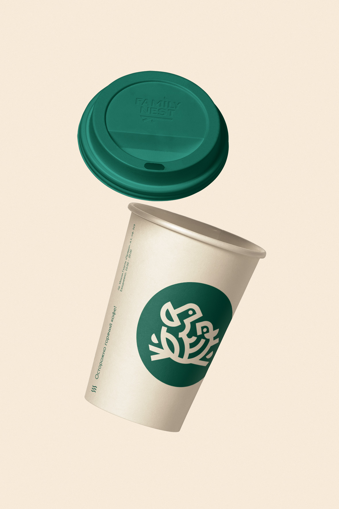
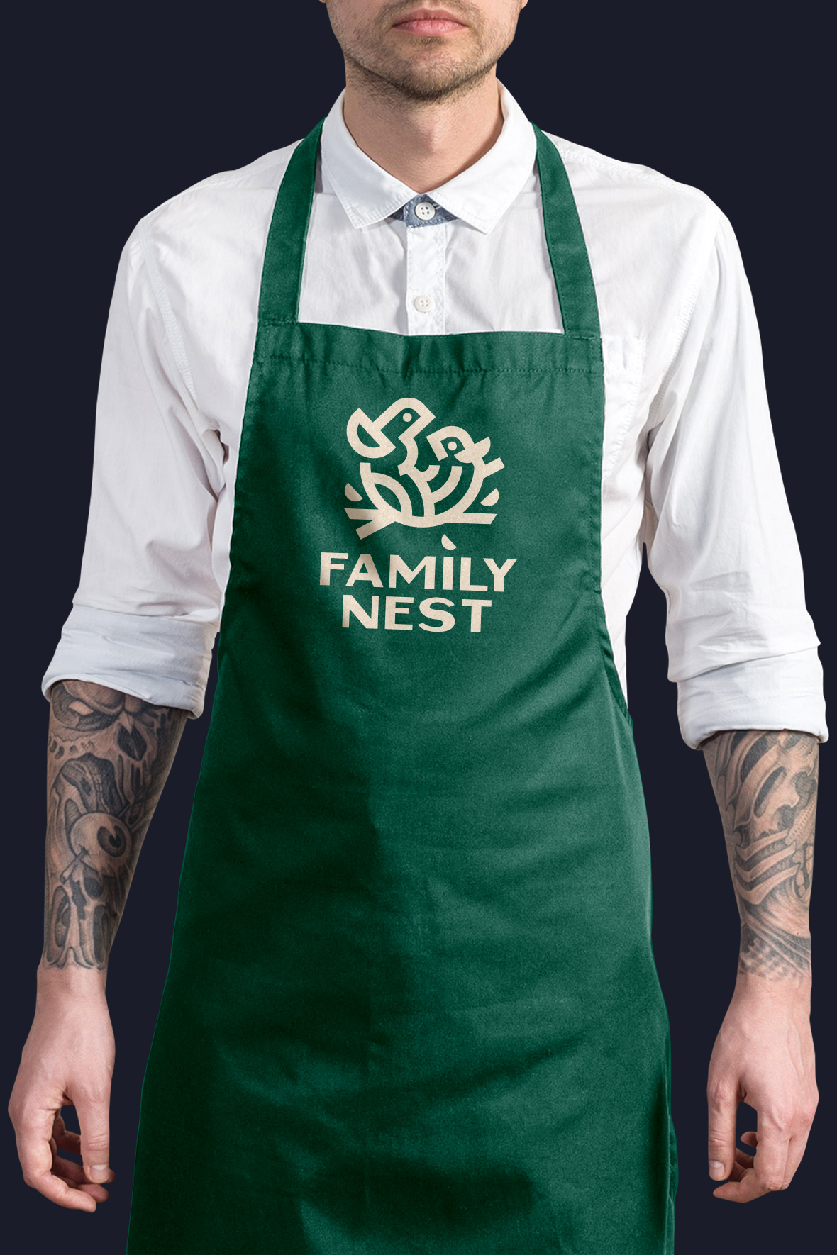
We designed a logo for the guys that (immodestly) looks perfect on media.
The sign has just enough details to convey the meaning and emotion without distracting attention. The grotesque typeface conveys reliability and naturalness. And rhyming details tie the logo together. Natural flowers simply blow calmness.
Client
Family Nest
Services
Corporate branding
Logo
Date
September, 2021
Let's talk business
Fill out the form and we will contact you. As a rule, this happens during the working day.


